A tooltip is a small pop-up window that describes a control being pointed to, usually referred to as a “tool”, and they are commonly used to provide labelling for controls that only display an image, such as toolbar buttons.

Simple tooltip
Earlier versions of OpenInsight supported some basic tooltip functionality for a very limited set of controls via the HELPTEXT property, but for version 10 the name HELPTEXT has been deprecated for all standard controls (i.e. for objects other than menu items) and renamed toTOOLTIP instead, thereby bringing it in line with standard Windows terminology. The nameHELPTEXT can still be used however, to preserve backwards compatibility with your existing code.
Unlike in previous versions the new TOOLTIP property is not a single string, because there are more attributes that can be set – It is now an @fm-delimited dynamic array structured as follows:
   <1> Text
   <2> Title
   <3> Icon
   <4> Large Icon
   <5> Balloon Style
   <6> Centered
Text
This is the text to display. Multiple lines are delimited by @tm. This attribute is required for the tooltip to be displayed.

Tooltip with multiple lines
Title
This is the title to display in the tooltip. This is an optional attribute.
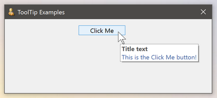
Tooltip with title
Icon
This attribute is only valid if the Title attribute is set. It should contain the name of an icon file or resource to display in the tooltip (as per the usual ICON property). Alternatively you can pass one of the following special characters to use a standard Windows icon instead (in a similar manner to the Msg() function):
- “*” – Use the standard Information icon
- “!” – Use the standard Warning icon
- “H” – Use the standard Error icon
Tooltip with icon
Large Icon
Normally the tooltip uses a 16×16 pixel size icon. When this attribute is set to TRUE$ the tooltip will use a 32×32 pixel size one instead. The default value is FALSE$.
Tooltip with large icon
Balloon Style
Standard tooltips use a rectangle shape when they are displayed. When this attribute is set to TRUE$ a “balloon” shape is used instead, with a stem pointing to the owning tool. The default value is FALSE$.

Balloon style tooltip
Centered
Tooltips normally display themselves at an offset to their tool – when this attribute is set to TRUE$ the tooltip is centered underneath the tool instead. The default value is FALSE$.

Tooltip with center-style
Basic+ example:
   // Example: display a multiline balloon tooltip containing a warning icon
   // and title for a static control called TXT_ALERT

   declare function rti_ErrorText
   $insert ps_Tooltip_Equates
   $insert logical

   tooltip = ""
   tooltip<PS_TOOLTIP_POS_TEXT$>    = rti_ErrorText( "SP", errorCodes )
   tooltip<PS_TOOLTIP_POS_TITLE$>   = "Woeful tidings"
   tooltip<PS_TOOLTIP_POS_ICON$>    = PS_TOOLTIP_ICON_WARNING$  ; // "!"
   tooltip<PS_TOOLTIP_POS_BALLOON$> = TRUE$

   call set_Property_Only( @window : ".TXT_ALERT", "TOOLTIP", tooltip )
The TOOLTIP property applies to all controls except OLE controls, as these usually provide their own tooltips. Some controls, such as List Box and Toolbar controls, also support different types of tooltips such as in-place and tracking, and these will be described in a future post.
(Disclaimer: This article is based on preliminary information and may be subject to change in the final release version of OpenInsight 10).
